SaaS Pricing Pages: 15 Examples, Design Patterns, and What Actually Converts
15 real SaaS pricing page examples analyzed - what works, what doesn't, psychological pricing tactics, A/B testing frameworks, and the design patterns that drive conversions.
Your pricing page is the most visited page on your website that is not your homepage. It is also probably the worst designed.
Most SaaS pricing pages are built by a product team that thinks in features, designed by someone who has never spoken to a buyer, and approved by a CEO who picked the tier names in a Slack thread. The result is a page that lists 47 features nobody understands, uses plan names like “Pro” and “Enterprise” that communicate nothing, and buries the actual price behind a “Contact Sales” button that 80% of visitors will never click.
This is a conversion problem hiding in plain sight. Your pricing page is the last stop before someone becomes a customer or a pipeline opportunity. Every other page on your site exists to get someone here. If this page fails, everything upstream was wasted effort.
This guide from PipelineRoad analyzes 15 real SaaS pricing pages, breaks down the design patterns that drive conversions, covers the psychological pricing tactics that work (and the ones that backfire), provides an A/B testing framework, and shows you what does not work so you can stop copying bad patterns from competitors who are also guessing.
Why Your Pricing Page Matters More Than You Think
The pricing page is not just a place to display prices. It is a decision-making environment. Buyers arrive at your pricing page with three questions:
- Can I afford this? (Budget qualification)
- Which plan is right for me? (Self-segmentation)
- Is this worth it? (Value assessment)
A well-designed pricing page answers all three in under 30 seconds. A poorly designed one creates confusion, anxiety, and tab-closing.
Here is what the data says:
- Pricing is the second most visited page for 80% of SaaS websites (Source: Profitwell, 2024 SaaS Pricing Benchmarks)
- SaaS companies that display transparent pricing see 2-3x higher demo request rates than those that hide pricing behind “Contact Sales” (Source: OpenView Partners, 2025 Product Benchmarks)
- The average SaaS pricing page converts 3-5% of visitors to a signup or demo request. Top performers hit 7-10%. (Source: Unbounce Conversion Benchmark Report, 2025)
- 62% of B2B buyers say they disqualify vendors who do not show pricing before engaging with sales (Source: TrustRadius 2025 B2B Buying Disconnect Report)
That last stat is the one that should keep you up at night. Hiding your pricing does not create intrigue. It creates friction that sends two-thirds of your prospects to a competitor who does show pricing.
The Anatomy of a High-Converting Pricing Page
Before we look at examples, here are the eight elements every effective SaaS pricing page includes:
1. Value-Anchoring Headline
The headline above your pricing tiers should frame value, not just announce pricing. “Choose your plan” is a wasted headline. “Scale your revenue with the plan that fits your team” ties the pricing decision to an outcome.
The best pricing page headlines answer the question: “What will I get if I pay this?“
2. Three Tiers (Usually)
Three pricing tiers leverage a well-documented cognitive bias called the center-stage effect. When presented with three options, buyers disproportionately choose the middle one. This is why the middle tier should be your target plan - the one with the best margin and the one most customers should buy.
Two tiers work for simple products (Free + Paid). Four tiers work when you serve genuinely different segments. Five or more tiers is almost always a mistake - it creates choice paralysis and increases bounce rates.
3. Visual Hierarchy That Guides the Eye
The “recommended” tier should be visually distinct. Larger card, different background color, a “Most Popular” badge, or a subtle border. The goal is to make the decision feel easy by telling the buyer: “Most people like you choose this one.”
4. Feature Comparison That Does Not Overwhelm
List 5-8 features per tier on the main pricing cards. Put the full 30-feature comparison in an expandable table below. Nobody reads 30 features before clicking a CTA. They scan 5-8 to confirm the plan has what they need, then click.
5. Social Proof Near the Decision Point
Logos, testimonials, or customer counts placed directly above or below the pricing tiers. Not buried in a separate section. The buyer needs reassurance at the moment of decision, not three scrolls later.
6. FAQ Section
Every pricing page should have an FAQ that addresses the real objections: “Can I switch plans?” “What happens when my trial ends?” “Is there a setup fee?” “Can I cancel anytime?” These are the questions that stop buyers from clicking the CTA. Answer them before they have to ask.
7. Annual/Monthly Toggle
Display annual pricing as the default. Show the monthly price as an option. Make the savings visible. “Save 20%” or “2 months free” are both effective framings.
8. Low-Friction CTA
“Start free trial” converts better than “Buy now.” “Get started” converts better than “Sign up.” The CTA should match the buyer’s commitment level. On a pricing page, they are evaluating - not committed. The CTA should lower the barrier, not raise it.
15 SaaS Pricing Pages Analyzed
1. Slack - The Gold Standard of Simplicity
URL: slack.com/pricing
What they do right:
- Four tiers with clear names that communicate value: Free, Pro, Business+, Enterprise Grid
- Per-user pricing displayed prominently with no ambiguity
- “Most Popular” badge on Business+ tier
- Minimal feature list on the main cards (6-7 per tier) with expandable full comparison below
- Each tier leads with a one-sentence value proposition, not a feature list
- CTA language is low-commitment: “Get started” for self-serve, “Contact sales” for enterprise
What they could improve:
- No social proof on the pricing page itself
- The free tier CTA and Pro CTA use the same “Get started” language, which creates ambiguity about what clicking will do
- Feature list uses internal jargon (“Workflow Builder” means nothing to a first-time visitor)
Design pattern: Clean grid layout with white cards on light gray background. Recommended tier uses a subtle purple border. No clutter.
Conversion tactic: The free tier is generous enough that teams start using it immediately. Pricing page conversion is less important because the product itself sells the upgrade.
2. HubSpot - The Complexity Handler
URL: hubspot.com/pricing
What they do right:
- Product-line tabs (Marketing, Sales, Service, CMS, Operations) allow self-segmentation before pricing
- “Bundles” tab for buyers who need multiple products
- Starter tier pricing starts at $0 (free tools) which reduces sticker shock
- “Calculate your price” tool for custom configurations
- Strong social proof: “228,000+ customers in over 135 countries”
What they could improve:
- Overwhelming complexity. The full pricing page requires multiple clicks to understand total cost
- Add-on pricing is hidden until deep in the configuration flow
- Different products have different tier names, creating cognitive overhead for bundle buyers
- Contact-based pricing means the displayed price is never the real price
Design pattern: Tab-based navigation with horizontal tier cards. Each product line has its own pricing structure, which is necessary given the product complexity but creates a confusing first impression.
Conversion tactic: The free tier hooks users into the ecosystem. Once they are using HubSpot CRM for free, upgrading to paid Marketing Hub is a natural progression. The pricing page is less about converting cold visitors and more about upselling existing users.
3. Linear - The Design-Led Approach
URL: linear.app/pricing
What they do right:
- Three tiers with descriptive names: Free, Standard, Plus (not Pro/Enterprise/Ultimate)
- Exceptionally clean design that matches the product’s aesthetic
- Per-member pricing shown in large, unmistakable type
- Feature comparison uses check marks and dashes - no verbose descriptions
- “Start building” CTA is action-oriented and specific to their product
What they could improve:
- No FAQ section
- No social proof on the pricing page
- Enterprise tier says “Contact us” with no guidance on what makes a company “enterprise”
- Feature list is minimal to the point of not explaining what each feature does
Design pattern: Minimal, dark-mode aesthetic with plenty of white space. Features listed in a clean grid with subtle dividers. The design itself communicates the product’s value proposition (simplicity, speed, craft).
Conversion tactic: The entire brand screams “we are the premium tool for teams that care about quality.” The pricing page does not need to sell hard because the brand does the heavy lifting.
4. Notion - The Freemium Funnel
URL: notion.so/pricing
What they do right:
- Four tiers: Free, Plus, Business, Enterprise
- Free tier is genuinely useful (not just a demo)
- Annual/monthly toggle with clear savings callout (“Save up to 28%”)
- Feature comparison is organized by category (Content, Collaboration, Admin) which helps buyers find what they care about
- “Get started” CTA on free and paid tiers, “Request a demo” on enterprise
What they could improve:
- Per-member pricing can feel expensive when multiplied across a large team
- The jump from Plus ($10/member/mo) to Business ($18/member/mo) is significant and the value difference is not immediately clear
- Too many features listed on the main cards - creates scanning fatigue
Design pattern: Light, airy design with rounded card corners. The Plus tier is highlighted with a subtle background color change and a “Popular” badge.
Conversion tactic: Notion’s free tier is one of the most generous in SaaS. The pricing page exists primarily to convert free users to paid, not to convert cold visitors. This changes the design requirements - the audience already knows the product.
5. Figma - The Segment Splitter
URL: figma.com/pricing
What they do right:
- Separate pricing sections for different products (Figma Design, FigJam, Dev Mode)
- “Most popular” badge on the Professional tier
- Clear per-editor pricing with free viewer access communicated prominently
- Feature list is short and outcome-oriented (“Unlimited files” vs. “File storage management system”)
- Testimonial carousel directly below pricing tiers
What they could improve:
- Multiple products on one pricing page creates initial confusion about what you are pricing
- The Organization tier (enterprise) shows “Contact Sales” which is standard but creates a dead end for the 30% of enterprise buyers who want to see a price
Design pattern: Two distinct product sections on one page, each with its own tier structure. Bold category headers help readers navigate.
Conversion tactic: The “free for students and educators” callout builds the user base in universities, creating long-term demand when those students enter the workforce and advocate for Figma at their companies.
6. Stripe - The Usage-Based Model
URL: stripe.com/pricing
What they do right:
- Transparent per-transaction pricing displayed prominently (2.9% + 30 cents)
- No tiers in the traditional sense - usage-based pricing removes the “which plan?” decision entirely
- Detailed breakdown of fees by payment type (cards, ACH, invoicing)
- “Volume discounts available” signals flexibility for larger customers without hiding base pricing
- Clean two-column layout: pricing on the left, features on the right
What they could improve:
- Usage-based pricing makes it hard for prospects to predict their monthly cost
- No cost calculator on the page (competitors like Adyen include one)
- The “integrated” vs. “customized” package distinction is not immediately clear
Design pattern: No traditional tier cards. Instead, a clean list of per-transaction prices with feature descriptions. This works because Stripe’s pricing model does not fit the three-tier template.
Conversion tactic: By displaying pricing transparently and per-transaction, Stripe eliminates the biggest objection for small teams: “Will this cost me $500/month before I have any revenue?” The answer is visibly no. You pay as you earn.
7. Calendly - The Plan-Name Masterclass
URL: calendly.com/pricing
What they do right:
- Tier names that communicate use case: Free (Always free), Standard (For individuals), Teams, Enterprise
- Clear per-seat pricing
- “Most Popular” badge on Teams tier
- Feature comparison organized by workflow (“Scheduling,” “Customization,” “Integrations”)
- FAQ section that addresses the real questions: “What happens if I exceed the limit?”
What they could improve:
- The Standard tier at $10/seat/month feels like it should be free given the feature set
- Too many features listed on the main cards
- The “Talk to Us” CTA on Enterprise feels warmer than the typical “Contact Sales”
Design pattern: Horizontal card layout with the recommended tier elevated slightly. Feature lists use icons and short descriptions.
Conversion tactic: The free plan is limited to one calendar connection and one event type - just enough to experience the value, not enough to avoid paying. This is precise freemium calibration.
8. Intercom - The Outcome-Based Framing
URL: intercom.com/pricing
What they do right:
- Tiers are named after outcomes: Essential, Advanced, Expert
- Pricing is resolution-based (per resolved conversation), aligning cost with value delivered
- “Calculate your price” tool helps prospects estimate monthly cost
- Social proof section with recognizable logos immediately below pricing
What they could improve:
- Resolution-based pricing is unfamiliar and requires explanation - some visitors will bounce before understanding it
- The pricing calculator adds complexity to what should be a quick evaluation
- Add-on pricing (Fin AI, Proactive Support) is displayed below the main tiers and can significantly increase total cost
Design pattern: Bold, colorful cards with gradient backgrounds. Each tier includes a one-sentence value prop above the price.
Conversion tactic: Resolution-based pricing is a strategic move that aligns Intercom’s revenue with customer success. When the customer resolves more conversations, both parties benefit. This is sophisticated value-based pricing that only works because Intercom has the market position to educate buyers on a new model.
9. Ahrefs - The Anti-Freemium
URL: ahrefs.com/pricing
What they do right:
- Four tiers with clear audience labels: Lite (for small teams), Standard (for marketers), Advanced (for agencies), Enterprise
- Usage limits are prominently displayed (crawl credits, reports, keywords tracked)
- Feature comparison table is detailed and organized by tool (Site Audit, Rank Tracker, etc.)
- Pricing is straightforward - no per-seat complexity for the lower tiers
What they could improve:
- No free plan or free trial (they offer a trial for Webmaster Tools only)
- The pricing page does not address the “why no free trial?” question that 90% of visitors have
- Tier names are generic (Lite, Standard, Advanced) and do not communicate value
Design pattern: Clean white layout with blue accent colors matching the brand. Standard tier is highlighted with a “Popular” tag.
Conversion tactic: By not offering a free trial, Ahrefs forces a commitment that self-selects for serious buyers. This is contrarian and works specifically because Ahrefs has enough brand authority and content to build trust before the pricing page. Do not copy this unless you have a similar moat.
10. Webflow - The Segment-First Approach
URL: webflow.com/pricing
What they do right:
- Two distinct pricing categories: Site plans and Workspace plans
- Within Site plans, further segmentation by use case (General, Ecommerce, Localization)
- Clear “Start building” CTA on every tier including the free tier
- Feature comparison uses expandable categories to prevent overwhelming the buyer
What they could improve:
- The dual pricing structure (site + workspace) is genuinely confusing for new visitors
- Total cost requires mental math (site plan + workspace plan = actual monthly cost)
- Too many plan options when you include both categories - easily 10+ combinations
Design pattern: Tabbed interface at the top for plan categories, then horizontal tier cards below. Each tab has its own set of tiers.
Conversion tactic: The generous free tier lets designers build and publish a site before paying. By the time someone hits a paid feature, they have invested hours of design work they do not want to recreate elsewhere. This is switching cost as a growth lever.
11. Loom - The Visual Proof
URL: loom.com/pricing
What they do right:
- Three simple tiers: Starter (free), Business, Enterprise
- Video recording limits are the clear upgrade trigger (25 videos free, unlimited on paid)
- The pricing page includes embedded Loom videos explaining features - using the product to sell the product
- Clean, minimal design with plenty of white space
What they could improve:
- Per-creator pricing can feel expensive for large teams
- The gap between free (limited) and Business ($15/creator/mo) is wide enough that some teams stay on free indefinitely
- No middle tier to capture the gap
Design pattern: Minimal three-column layout. Business tier is visually highlighted. Feature list is short and focused on the differences between tiers rather than restating shared features.
Conversion tactic: Using Loom videos on the Loom pricing page is genius meta-marketing. It demonstrates the product value while explaining the product value. More SaaS companies should use their own product on their pricing page.
12. Monday.com - The Calculator Play
URL: monday.com/pricing
What they do right:
- Seat-count slider that updates pricing in real-time
- Five tiers spanning individual use to enterprise
- “Most Popular” badge on the Standard tier
- Total monthly cost shown prominently (not just per-seat)
- “Save 18%” annual billing callout is clearly visible
What they could improve:
- Five tiers creates decision complexity
- The Free and Individual tiers overlap confusingly
- Feature lists are long and use internal product terminology
Design pattern: Interactive pricing with a seat slider. Tier cards update dynamically as the slider moves. This is effective for per-seat models where total cost varies significantly.
Conversion tactic: The seat slider forces the buyer to self-identify their team size, which is also a qualification signal. Monday.com knows that teams of 3 behave differently than teams of 30, and the slider interaction tells them which segment this visitor belongs to.
13. Zapier - The Usage Anchor
URL: zapier.com/pricing
What they do right:
- Pricing tied to tasks (automations run) per month, which scales with value
- Five tiers with clear task limits: Free (100 tasks/mo), Starter (750), Professional (2K), Team (50K), Company (100K+)
- The free tier gives enough tasks to demonstrate value without being useful long-term
- Clear upgrade path based on usage growth
What they could improve:
- “Tasks” as a pricing unit requires explanation for new users
- The jump from Professional to Team is massive ($49 to $69/mo but also a 25x task increase)
- Five tiers is one too many for most visitors
Design pattern: Horizontal tier cards with task counts as the primary differentiator. Usage-based tiers make the comparison more about volume than features.
Conversion tactic: Task-based pricing means customers upgrade naturally as they build more automations. The pricing page conversion is less important than the in-product upgrade prompts when users hit their task limits.
14. Amplitude - The Enterprise Hybrid
URL: amplitude.com/pricing
What they do right:
- Three tiers: Starter (free), Plus, Growth (enterprise)
- The free tier is genuinely powerful (up to 50M events/month)
- Feature comparison organized by capability area
- “Talk to sales” on the Growth tier includes a sentence about what the call covers, reducing uncertainty
What they could improve:
- The Plus tier shows pricing but the Growth tier does not, creating inconsistency
- Limited social proof on the pricing page
- The feature list uses technical terms that non-technical buyers may not understand
Design pattern: Clean three-column layout. The Plus tier is highlighted. Minimal visual clutter.
Conversion tactic: The free tier is so generous that it captures startups who will eventually grow into paying customers. This is a long-term bet on market expansion rather than a short-term conversion optimization.
15. Gong - The “No Pricing” Play
URL: gong.io/pricing
What they do right:
- Nothing on this list. Gong does not show public pricing at all.
Why it works anyway:
- Gong’s ACV is $30K-$100K+. At this price point, every deal is custom.
- Their brand is strong enough that buyers contact them despite the friction.
- The pricing “page” is actually a demo request page that captures contact info - it converts the pricing page visit into a pipeline opportunity.
Why you should not copy this: Unless your ACV is $50K+ and your brand has category-leader recognition, hiding pricing drives away more buyers than it captures. The companies that successfully hide pricing are the exception, not the rule. For every Gong, there are a hundred SaaS companies whose “Contact us for pricing” page has a 95% bounce rate.
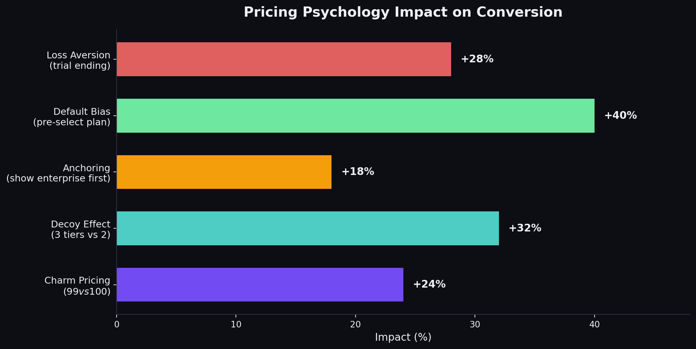
Psychological Pricing Tactics That Actually Work
The Decoy Effect
Add a tier that nobody is supposed to buy but that makes your target tier look like a better deal. If your Basic plan is $29/mo and your Pro plan is $79/mo, adding a “Plus” plan at $69/mo with fewer features than Pro makes Pro look like the obvious choice.
The Economist ran a famous study on this: when they offered Print ($125) and Web+Print ($125), 84% chose Web+Print. When they added a Web-only option ($59), the percentage choosing Web+Print increased because the Print-only option at $125 made Web+Print look like a steal.
Price Anchoring
Show the most expensive tier first (left-to-right on desktop). This anchors the buyer’s reference point high. When they see the mid-tier option, it feels reasonable by comparison. Many SaaS companies do this backwards - showing the cheapest tier first, which anchors expectations low and makes every subsequent tier feel expensive.
This works best when the enterprise tier has a high but visible price. If the anchor is “Contact us,” the anchoring effect is weakened because the buyer cannot process an unknown number.
Charm Pricing ($X9 vs. Round Numbers)
$49 feels significantly cheaper than $50 to most buyers. This is one of the most replicated findings in pricing psychology (MIT and University of Chicago, 2003). It works for consumer products and SMB SaaS. It does not work for enterprise SaaS, where round numbers ($5,000/mo) signal maturity and reduce perceived nickel-and-diming.
When to use $X9: SMB and mid-market products under $500/mo. When to use round numbers: Enterprise products over $1,000/mo, and any pricing that will appear in procurement documents.
The Default Bias
Whatever option you present as the default, more people will choose it. If annual billing is pre-selected on your toggle, more people will buy annual. If the Professional tier is visually highlighted, more people will choose Professional.
This is not manipulation. It is guiding the buyer toward the option that is genuinely best for most customers. Your mid-tier exists because most customers need it. Make it easy to choose.
Loss Aversion Framing
“Save $240/year with annual billing” is more effective than “Get 20% off with annual billing.” Dollar amounts trigger loss aversion more strongly than percentages because the buyer can immediately feel the money they would lose by choosing monthly.
A/B Testing Your Pricing Page: A Framework
Most SaaS companies have never tested their pricing page. They designed it once, argued about it in a meeting, shipped it, and forgot about it. Meanwhile, they A/B test their homepage hero section for the fourth time this quarter.
Here is a testing framework:
What to Test (In Priority Order)
-
Plan highlighting - Which tier is visually emphasized? Test emphasizing your target tier vs. no emphasis vs. emphasizing the tier above your target (to drive consideration of the higher tier).
-
Toggle default - Monthly vs. annual as the default selection. This single test can shift annual plan adoption by 10-20 percentage points.
-
CTA copy - “Start free trial” vs. “Get started free” vs. “Try it free” vs. “Start building.” Test 2-3 variants at a time.
-
Feature display - Showing 5 key features per tier vs. full feature list vs. expandable feature comparison. Less is usually more.
-
Social proof placement - Logos above pricing vs. below pricing vs. integrated into tier cards vs. none.
-
Price display - Monthly price shown with annual toggle vs. annual price shown with monthly toggle vs. showing both simultaneously.
-
Tier names - Descriptive names (Starter, Growth, Scale) vs. audience names (Individuals, Teams, Enterprise) vs. abstract names (Basic, Pro, Enterprise).
How to Run Pricing Page Tests
Minimum traffic: You need at least 1,000 unique visitors per variant over the test period to reach statistical significance. If your pricing page gets 500 visitors/month, a two-variant test will take four months. Consider testing on higher-traffic pages first to build confidence in your testing process.
Duration: Run every test for a minimum of 14 days to account for day-of-week variations in traffic quality. Ending a test after three days of positive results is the most common testing mistake.
Primary metric: Pricing page CTA click rate (visitors who click any CTA on the pricing page). This is your conversion signal.
Secondary metric: Downstream activation or demo completion rate. A variant that increases CTA clicks but decreases actual trial activations is a false positive. Always track the downstream metric.
What NOT to test:
- Actual prices (too risky for an A/B test - existing customers will see different prices)
- Number of tiers (this is a strategic decision, not a design optimization)
- Core value proposition (the pricing page is the wrong place to discover your messaging)
What Does Not Work: Pricing Page Anti-Patterns
The Feature Matrix From Hell
Listing 40+ features in a comparison table where every tier has a checkmark in almost every row. If the difference between your plans is 3 features out of 40, your packaging is wrong - not your pricing page design.
Custom Pricing on Every Tier
“Contact us for pricing” on all three tiers signals that you either do not know what to charge or you want to maximize every deal. Buyers interpret this as “I am going to get price-anchored by a sales rep.” Show at least the starting price for your first two tiers.
The Feature Dump With No Context
“API access (10,000 calls/day)” means nothing to a buyer who does not know whether they will use 100 calls or 100,000. Add context: “Enough for most growing teams” or “For teams processing 1,000+ records daily.”
Hiding the Annual/Monthly Toggle
Some companies show only annual pricing and bury the monthly option in the FAQ. Buyers who discover the monthly price is 30-40% higher feel deceived. Show both and let the savings speak for themselves.
The Enterprise Cliff
“Starter: $29/mo. Pro: $79/mo. Enterprise: Contact us.” The gap between a visible $79 and an invisible enterprise price creates anxiety. Buyers assume enterprise means $5,000/mo+. If your enterprise plan is $200/mo, show the price. If it is genuinely custom, at least say “Starting at $200/mo.”
Per-Seat Pricing Without a Team Calculator
If you charge per seat and your target customers have teams of 10-50 people, not showing the total team cost is leaving conversion on the table. Add a slider or input field that calculates total monthly cost based on team size. Monday.com does this well.
No FAQ Section
Every pricing page visitor has questions they will not ask. “What happens when my trial ends?” “Am I locked into a contract?” “Can I downgrade?” If you do not answer these on the page, 20-30% of your visitors will leave to find the answer and never come back.
Before and After: Pricing Page Improvements That Moved the Needle
Case: B2B SaaS Company ($15K ACV) - Showing Price vs. Hiding It
Before: “Contact us for pricing” on all tiers. Demo request CTA. Monthly demo requests: 45. After: Displayed starting prices for two lower tiers, kept “Contact us” for enterprise. Monthly demo requests: 112. Lift: 149% increase in demo requests. Why it worked: Buyers who saw pricing and still requested a demo were pre-qualified on budget. Sales close rate increased from 18% to 27% because unqualified buyers self-filtered out.
Case: Dev Tools Company ($49/mo) - Toggling Annual Default
Before: Monthly pricing shown as default, annual pricing shown as option. After: Annual pricing shown as default with “Save 2 months” badge, monthly as option. Lift: Annual plan adoption went from 34% to 58% of new signups. Why it worked: Default bias. Most buyers accept the pre-selected option unless they have a strong reason to switch. The savings badge provided rational justification for the default choice.
Case: Marketing SaaS ($5K ACV) - Reducing Tier Features Displayed
Before: 18 features listed per tier on the main pricing cards. After: 6 key features per tier on cards, with “Compare all features” expandable table below. Lift: Pricing page CTA click rate increased from 3.2% to 5.1%. Why it worked: Fewer features reduced cognitive load. Buyers could scan and decide in seconds instead of minutes. The expanded table was still available for detailed comparison but did not slow down the primary decision flow.
Building Your Pricing Page: The Checklist
If you are designing or redesigning your SaaS pricing page, work through this list:
Structure:
- Three tiers (unless you have a specific reason for more or fewer)
- Value-anchoring headline above the tiers
- Annual/monthly toggle with annual as default
- 5-8 features per tier on the main cards
- Expandable full feature comparison below
- FAQ section addressing top 5-7 buyer objections
- Social proof (logos, customer count, or testimonial) near the pricing tiers
Design:
- Target tier is visually highlighted (badge, border, background color, or elevation)
- CTAs use contrasting colors that stand out from the page
- White space between tiers prevents visual crowding
- Mobile-responsive layout (single column on mobile with swipe or tabs)
- Page loads in under 2 seconds
Copy:
- Tier names communicate who the plan is for or what it enables
- CTAs use low-commitment language (“Start free trial,” not “Buy now”)
- Features are described in outcome language, not technical language
- Annual savings are shown in dollar amount, not just percentage
- Enterprise tier includes some guidance on who it is for
Post-Launch:
- Heat mapping installed to see where visitors click, scroll, and drop off
- A/B testing plan for the next quarter (start with toggle default and CTA copy)
- Monthly review of pricing page conversion rate and downstream metrics
- Quarterly review of tier mix (what percentage of customers choose each tier?)
The Pricing Page Is a Product Decision, Not a Marketing Decision
Here is the thing most SaaS companies get wrong: they treat the pricing page as a marketing asset. It is not. It is a product decision expressed as a web page.
Your pricing page reflects your packaging strategy, which reflects your understanding of your customer segments, which reflects your entire go-to-market approach. If your pricing page is confusing, the problem is almost never the design. It is the underlying packaging.
Three questions to ask before you touch the design:
-
Who are your distinct buyer segments, and do they need different things? If yes, your tiers should map to those segments. If you cannot articulate who each tier is for, your packaging is wrong.
-
What is the upgrade trigger? What causes a customer to outgrow their current plan? Seats? Usage? Features? The upgrade trigger should be obvious on the pricing page.
-
What does your best customer buy? Look at your top 20% of customers by revenue. Which plan are they on? That is the plan your pricing page should steer everyone toward.
Get the packaging right, and the pricing page almost designs itself. Get the packaging wrong, and no amount of A/B testing will fix the conversion problem. For the tactical checklist on tier structure, psychology, and testing, see our SaaS pricing page best practices guide.
If you are building the broader marketing strategy around your pricing page, our SaaS marketing plan template covers channel selection, budgeting, and execution roadmaps.
The best pricing pages in SaaS are not the prettiest ones. They are the ones where the company deeply understands its customers, packages the product around real use cases, and presents the options with enough clarity that the buyer feels confident choosing in 30 seconds.
That is harder than picking a template and filling in the blanks. But it is the only approach that actually works.
Frequently Asked Questions
What makes a good SaaS pricing page?
A good SaaS pricing page does four things: it makes the right plan obvious (usually by highlighting a 'Most Popular' tier), it anchors value before showing price (leading with outcomes, not features), it reduces decision anxiety (with FAQs, guarantees, and social proof), and it makes the next step frictionless (clear CTAs with low commitment language like 'Start free trial' instead of 'Buy now'). The best pricing pages convert 3-7% of visitors to signups or demo requests.
How many pricing tiers should a SaaS product have?
Three tiers is the standard for a reason - it leverages the center-stage effect where buyers gravitate toward the middle option. Two tiers work for simple products with a clear free-to-paid upgrade path. Four tiers work when you serve genuinely distinct segments (startup, growth, enterprise). More than four creates decision paralysis. If you need five or more plans, you have a packaging problem, not a pricing page problem.
Should SaaS companies show pricing on their website?
Yes, unless your ACV exceeds $50K and every deal is genuinely custom. Hiding pricing drives away 70-80% of buyers who want to self-qualify on budget before talking to sales. Companies that display pricing see 2-3x more demo requests because prospects who book have already confirmed budget fit. The 'Contact us for pricing' approach works for enterprise but kills conversion for SMB and mid-market.
Should I offer monthly and annual pricing?
Yes. Annual billing improves cash flow and reduces churn by 15-30%. Display the annual price as the default with the monthly price as an option. Show the savings clearly - '20% off' or 'Save $240/year' - but do not hide the monthly option entirely. Most SaaS companies see 40-60% of new customers choose annual when it is presented as the default with a clear savings callout.
What is the best CTA for a SaaS pricing page?
The highest-converting CTAs reduce commitment anxiety. 'Start free trial' outperforms 'Buy now' by 2-3x in most SaaS contexts. 'Get started free' outperforms 'Sign up.' For enterprise tiers, 'Talk to sales' outperforms 'Contact us' because it is more specific. The CTA should match the buyer's stage - do not ask someone to commit to a purchase on first visit. Let them try the product or talk to a human.
How do I A/B test my pricing page?
Test one variable at a time: tier names, price points, feature grouping, CTA copy, plan highlighting, or toggle defaults. Run tests for a minimum of two weeks or 1,000 visitors per variant, whichever comes later. Track two metrics: pricing page conversion rate (visitors who click a CTA) and downstream activation (visitors who actually start using the product). A change that lifts CTA clicks but drops activation is not a win.
Ready to build your SaaS marketing machine?
We've run these plays at 40+ B2B SaaS companies. Let's talk about yours.
Book a Strategy Call